Brand Identity | Vibes Studios
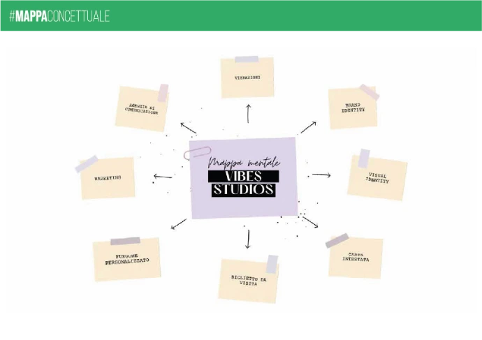
The brand identity project for Vibes Studio stems from the need to build a visual and conceptual identity capable of expressing energy, creativity, and emotional connection. As the design document shows, the work developed from a concept map, a key element for defining the brand's values, personality, and strategic direction.
Objective of the project
The primary goal was to translate the essence of Vibes Studio into a coherent, recognizable, and flexible visual system. Not just a logo, therefore, but a true identity ecosystem capable of:
Communicate brand positioning immediately
Conveying dynamism and contemporaneity
Create an authentic connection with your target audience
Creative process
The starting point was the definition of the concept map, a fundamental tool for organizing ideas, values, and perceptions related to the brand. This step allowed us to:
Identify the keywords that represent the studio's identity
Defining the tone of voice
Establish aesthetic and communication guidelines
The strategic phase then guided the visual development, ensuring coherence between concept and form.
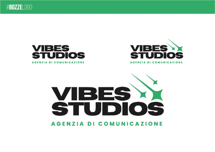
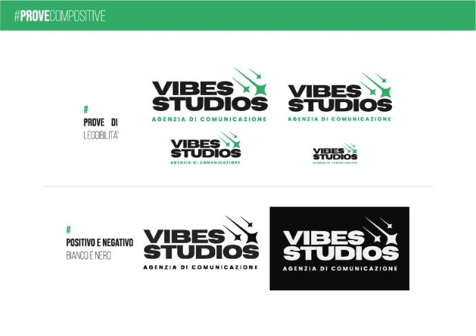
System and applications
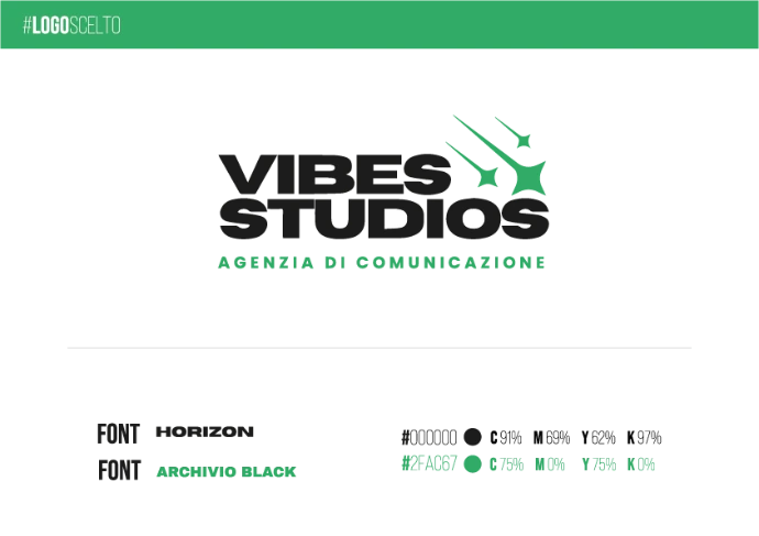
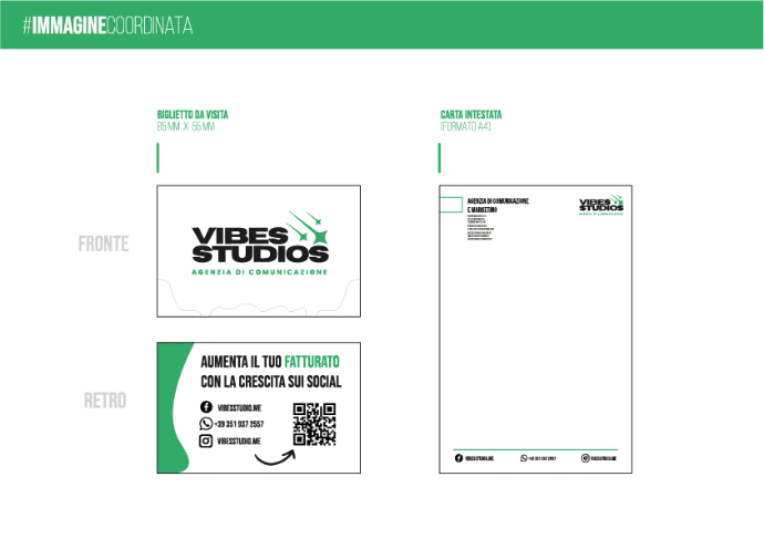
Brand identity is not limited to a graphic sign, but extends to a coordinated system that includes:
Guidelines for using the logo
Consistent color palette
Identifying typography
Applications on digital and paper materials
This systemic approach ensures uniformity of communication and solidity over time.
Conclusion
The brand identity project for Vibes Studio represents a structured process that combines strategy and creativity. Starting with a clear and well-defined concept map, it was possible to build a strong, dynamic, and authentic identity.
The result is a brand capable of transmitting its “vibes” in a coherent and distinctive way, ready to evolve while maintaining its essence intact.